Sunday, July 15, 2012

Special Effects and Production

I've been learning a lot lately about the production side of publishing, which is pretty interesting. By production I mean how the book is actually produced, eg printing, paper quality, binding, file formatting and special effects. It can get very technical at times! As I talk about "special effects" in this post, keep in mind that a lot of what I could share is lost through this digital conduit. There are a lot of textures and and interactive elements that just can't be captured without holding the book in your hands. Probably the best way to get a "hands on" experience with different book types would be to go to a bookstore and just explore the different paper types, cover types, and all of that fun stuff to give you an idea of what is possible out there. I've been amazed at what is possible!

Special effects in the world of publishing is pretty much the bells and whistles added to the book design to make it have a greater appeal to the consumer.

This Rangers Apprentice cover, for example, is printed on a glossy paper, but has an extra shiny layer on the branding element (which is the title of the series.) This extra shininess is "foil" and it is accompanied by an emboss which makes the shield surface and the words stick out of the surface a little bit. I'm sure we're all familiar with embossing.


This holographic effect is pretty cool. It is often accompanied with an emboss and adds a great element of interest to the image.

Just one more example of the many things effects can do to a book cover. This is a crackle effect.
Here are some other bells and whistles that can be a part of the book:
A book box, which is often used as part of a gift set.


Rough cut pages


Pop up books


Touch books


You get the idea. I think that effects open up a whole new dimension of design and illustration When you know that these things will be incorporated it can really effect your vision for the project.


Friday, June 29, 2012

Who is the boss?

As an art student, you have the luxury of choosing your own projects. Sure you will be assigned a technique, or be given a model, or be focusing on something, but for the most part it is up to you wether you draw a zombie or a unicorn.

In the world of commercial art, you almost always have somebody telling you what to do. At penguin it is your art director, the editors, or the sales people. I have seen artists and designers handle this in a variety of ways. Some combine several of these approaches.

1. Complain a lot and kind of hate their job.
2. Become content to do exactly what they are told.
3. Develop powers of persuasion and communication skills to make everybody happy.


Some of us do all three. In my opinion, almost any input is good input. There have been times that I develop a concept that I think rocks, and it is shot down. Then lo and behold, I come up with a new concept that is actually better than the first. Sometimes I end up having to do something that I think is not as cool. Sometimes I am able to sweet talk my way into doing what I want to do. I am sure there are other approaches to all of this. I think, however, that complaining and having a bad attitude is the worst thing you can do. The next worst thing is to just become a wrist for somebody else's ideas. I think that a great artist can come up with good ideas and SELL his ideas. Convince others to believe in it. Help others catch the vision. 


A mentor of mine once described graphic designers as "frustrated artists." That does not have to be true! In my short stay at Penguin I have seen a spectrum of attitudes toward being a designer and I have come to believe that it is all in your ability to sell your idea and choose your outlook. (other creative outlets outside of work help also) Get inventive with your processes! Try new approaches to problem solving. Choose to be passionate about your projects. 


Anyway, to step away from that schpeal, I have decided to spotlight some of my favorite picture books from time to time. 


This artist Sebastia Serra has a captivating style and a delicious color palette. I love the textures he is able to achieve with a 100% digital process. He adds great detail for small stories within his illustrations.  He also has developed a great reputation among art directors here at Penguin as someone who really delivers great sketches.  


PS One of my digital comps for a book cover was approved this week by Editorial and is being pitched to sales next week! Boo yeah! 

Tuesday, June 19, 2012

Editorial Wisdom

So...much...knowledge. Must...share...all! 


I've learned a lot of new things and I've done my darndest to write it all down to share with ya'll.


To add on to the list from before, I learned a couple of new terms for certain types of books. "Word Books" are very simple books for toddlers and young children. They are often board books and have very minimal text, like "ball, yellow" etc.  A "middle grade novel" is a step above a "chapter book" in complexity, but is not as long or difficult to read as a novel. 


Books that are rated ages 12 and up do not have any sex in them, however books that are rated 14 and up may have some sex in them. I will expound on book content/ratings another day.


We were lucky enough today to have a meeting with the Executive Editor over Dial books, which is an imprint of Penguin Group. She has been responsible for finding/publishing big name books like "The Ladybug Girl" over her years with Penguin.  I own a couple of the Ladybug Girl books and they are completely AWESOME. (more about Ladybug Girl to come)


This editor gave us a list of "What Editors Keep in Mind" when they are determining if they want to publish a book. I wrote them down and here they are!
1. Does this story surprise me?
2. Do I care about the main character?
3. Is there a good conflict, tension, climax and resolve?
4. Can kids relate to the main character?
5. Have I heard a story like this a million times?
6. Does the main character feel authentically young?
7. (for picture books) Is the art visually interesting throughout?

She also shared that most of her publications come from agent recommendations or reps, but not all of them. There are some submissions that are published because they are just so darn awesome. 

Something fascinating to me about the Ladybug Girl artist David Soman is that he was a published illustrator with a very photo realistic painting style. He, however, was influenced by manga and some of his other artistic passions and was able to create a new aesthetic that is just beautiful. In my opinion, that is a great way to allow manga/anime to be a blessing and not a burden to an artist. Certainly there is demand for manga, but I have seen it cripple artists by limiting their creative horizons. Anyway, thats just food for thought. 

I asked the question "Is an author/illustrator of children's books really writing the book for the parents?" and she said that she does not believe so. When she goes to approve a book, she is trying to publish something that kids will really love, and not trying to come up with a story that parents will want their kids to love. There is a level of marketability that is taken into account, but that isn't their primary focus. That is why there aren't many books about why you should clean your room! lol Kids don't want to read that kind of stuff!

I also asked about the validity of having an animal protagonist. She made a great point that animals transcend racial boundaries so they can be more universally applicable to readers. Music to my ears!

Found out today that the increase e-books has led to an increase in Young Adult sales and Erotica. Apparently people can read about teenagers and other embarrassing things without the fear of people seeing the cover! LOL!

The Editor recommended this website for aspiring authors/illustrators as a great starting point to take your ideas. http://www.scbwi.org//


Sunday, June 17, 2012

Launch and Book Branding

"Launch" is the day at the beginning of a new book season when new books and projects are pitched to sales representatives from around the US/World. Essentially each "imprint" of Penguin (eg Puffin, Speak, Razorbill etc) develops a powerpoint presentation that gives a quick synopsis of the book and a direction for the cover. Lots and lots of work has gone into each book already once launch comes around, but this is kind of the last chance for sales, marketing, or the like to put out any fires or change directions dramatically. While Launch represents a sort of "last chance for changes" for editorial people, it marks the beginning for the design team. It sort of represents a green light for us to go ahead hiring the illustrators or photographers proposed, and to punch the gas on the design process.

It was a very cool experience for me to attend launch this week. I sat right next to the executive art director and she told me who was who, and what was going on. There were representatives from Barnes and Noble, Amazon, Wal Mart and other retail stores all giving their 2 cents on what will make the book most successful.

Book covers, are certainly a huge part of the conversation at this meeting. People tend to love or hate a book cover, and unfortunately it seems that the cover can take the blame if a book does not do well in sales. Yeah...blame the artists! lol

The best part of all was that at the end of the Puffin launch, a project that I had helped work on a tiny bit was applauded and extremely well received. Boo yeah!

My art director this week was a woman who works mainly with illustrative book covers and has a work history with picture books.  "Picture books" are the books that pictures on every page. A little obvious but yeah, thats the official term.

The stinky cheese man is one of my favorite picture books.

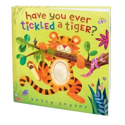
Then a "Chapter book" is geared toward young readers and has larger words with pictures throughout, but not necessarily on every page.

This is an example of a chapter book.

Then of course, novels are books that have a designed cover with the possibility of small illustrations for chapter headers etc. 


So with an art director who has a history in picture books, it was a very good scenario for me. I was very excited that she put me on a real life project of developing branding for a new fantasy series that is coming out soon. Branding for a series is essentially coming up with a visual element that remains consistent from book to book. 


This Brotherband Chronicles book shows a good example of branding. The wordmark on top that says the title of the series and the wooden background is part of the branding. Sometimes the illustrator will create the branding element under the direction of the designer, but more often the illustrator will submit the illustration and the designer will create the branding. 

So working on the branding was an exciting project to be assigned to. I drew up about 20 thumbnail sketches to show some directions we could go. After I got some feedback, I made 6 more refined drawings and got some feedback. Then I made 3 digital color comps with inserted illustration samples. My work was really well received by my AD so I'm excited to see what they will say next week when it is shown to the editor :)


I keep trying to ask as many questions as I can and recording what I learn. One thing that I asked about this week is "How do you, as an art director, choose an illustrator for a book?"

The short answer is that most big publishing companies work almost exclusively with Art Reps. Very, very rarely does an unsolicited mailer or email come to fruition. I, as the intern, was given the job of sorting through hundreds of mailers last week. The pile was large and the quality was all over the place. Some of the mailers were impressive, but even the good ones were seemingly drowning in the quantity. I am in no position to say that mailers will not get you work, but I have heard now from many sources that when big companies need an illustrator they immediately turn to Rep agencies. 

Unfortunately, in the great big world of art there is superfluous talent. That means that to get work almost always requires more than just talent (though if your art isn't good then none of this other stuff will matter at all.) Making and keeping connections, being versatile in your skill set, unabashed self promotion, and good art representatives are just some of the things that are very important in the art world. 

Oh and speaking of art reps; I learned that author/illustrators also use art reps. Trying to get a picture book published that is already "completed" is a real long shot. I don't even think it's an option with Penguin. Apparently there is a process of submitted ideas and reps that is part of a sort of due process. I'll try to elaborate on this more as I learn more. 

In other small news, I met with my core group of interns this week. It was a little bit....how shall I say...pointless, but at least I got to shock them all by telling them I've never had alcohol in my life and that I've been married for 2 years. They were even more surprised that I don't want to drink alcohol, which is why I've never had it in the first place! lol good times.

Well, as you can see this internship is an awesome learning experience. Please let me know if you have any questions! I'm sure that I can find the right person to ask!


Monday, June 11, 2012

My skills are put to the test!

This is the beginning of a new week, which means a new boss for me at Penguin. This week I'm working with a very pleasant art director and we are focusing on "book covers/the design process." How cool is that?! Right away I was assigned to jump onto a project with a designer. I wish I could go into detail about the concept and the book etc. because it is a really cool thing, but alas, it's still under wraps. I am, however, happy to report that a ton of my training, work experience, and academic history came into play today. I thought it might be useful for design/illustration students to know what kinds of skills I used today alone, just so that maybe any thoughts of "I'll probably never use this" can be replaced with "holy cow I could totally use this!" At the very least somebody might wonder what one of these things are and look it up or ask about it and learn. In photoshop I used drawing skills, textured brushes, my wacom tablet, masks, styles, brush styles, rulers, content aware, define pattern/custom brushes, and export to web/devices. In Illustrator I used the pen tool, pathfinder, stroke ends, offset path, and type setting. In InDesign I used rulers, paragraph styles, and the links pallet. In this project the art director referred to several types of traditional medias. Imitating traditional medias digitally is a norm in publishing. Oh yes and mock ups. It is important to make well crafted mock ups for your bosses. Today, that included cutting out covers and gluing them on to existing books with the same dimensions. 


One of the books we are designing has "french flaps" which, as you see here, are fold ins from the back and front covers of a paperback book. It is a little bit pricier and is reserved for special publications. 


Some books are intended to be sold as "gifts." These are extra fun because they are typically more artistic and include designing a hard case or "sleeve" for the book to be in. This is an image of a UK edition of Peter Pan that is a gift book. 


Tomorrow is "launch", which I will expound upon another day, but that made today pretty hectic. It was awesome to feel needed and helpful to the team. 

Some cool things about NYC and Penguishing. These massive in house printers are calibrated to match the prints from the printing company. This way, final mock ups can be pretty true to final product. Very helpful! 


Penguin has vending machines and the snacks within cost less than the ones at BYU-I. What...the...heck? C'mon BYU-I, don't you know we are students!?

A few things stood out to me right away as I work today. 1. This place assumes that I am competent.   I report my hours at the end of the week, and nobody is standing over my shoulder. 
2. They give me tasks with confidence that I can accomplish them. It is my responsibility to ask questions if I have questions, or to figure it out. They are more than happy to answer questions, but they dont' walk you through anything. 
3. Production experience is an absolute must. Nomenclature is important. File formats are important. Resolution and image size is important. Familiarity with filing and universal drives is important. I used to think of these things as a bother because it felt mildly mathematical. It is true that it is, but design with improper production is like eating through your ear hole. The stuff might be good, but it sure aint' gonna get where it needs to go, or accomplish what it is meant to accomplish. 
4. Talking to a designer today, she explained how she has a degree in fine arts and that she wants to be an illustrator someday. However, she worked for 3 years as a production designer and she has finally worked her way up to have the opportunity to be a designer with some creative license. It just started to dawn on me that a career as an artist comes with a price. To some, that price is paid in tireless hours of drawing and painting. To others, it is years of drab design work executing somebody else's ideas. However, if you stick with it, you can end up with a creative career. Just don't give up, and never assume that you don't have to put in the years of drudgery because somebody else will and will earn it over you. 


The Upper New York Bay, just a couple of blocks from work.

Thursday, June 7, 2012

My Lunch is my Gyro


On I go with the filing. It is almost done so I will feel very accomplished once this large task is completed. However, filing was only a small part of my duties the past couple of days. As a matter of fact, I actually got to use Photoshop today which was extremely exciting. And since I was using Photoshop, you know that I got my Penguin Employee login, email, and very soon, my id badge. Excellent.

I learned some more about the company, and I have some minor corrections to some of my previous statements. I am not the only design intern, but I am the only design intern of my kind, which it seems is  young readers and covers multiple "imprints" of the company such as Razorbill, Speak, Puffin, and other such imprints. Apparently an imprint is a sort of brand within penguin group. Each imprint has a target audience I think. I'll keep getting educated and sharing some of my knowledge. 

I also received my internship schedule today, which outlines my entire 10 week experience. It is incredible. Is is like a one on one publishing camp with a different focus each week. This week I am working with a supervisor who is over pre-production, budgets, and other things. It is a great way to start out because it gives me an overview of the process from its earliest phases. This whole experience is penguiriffic and best of all, I get to work with art directors and designers who are extremely talented and incredibly nice. 

Did I mention that my co-workers are incredibly nice? They are. One of the designers brought me a cookie from Jacques Torres, which is a fine candy store they were talking about in a meeting. It was about 80% chocolate and 20% cookie. That is a literal percentage. 


There are a couple of break rooms on my floor. Both of which have hot chocolate as an alternative to coffee. They must've heard I was comin!


Oh, and food is in no short supply around Hudson St. There are lots of places to eat, but already I have fallen for the street vendors. It's a sort of addiction. Here is an image of a lamb gyro that is absolutely phenomenal. If you've never had a lamb gyro, the meat is like a firm meatloaf that is slightly crunchy on the outside and very tender. Absolutely no gristle or fattiness in it. They put a white sauce on the gyro which is like a mild mayo/ranch. Very much legit. 


I also stand corrected about the image I posted on day one. Technically 375 has some Penguin offices in it, and that is where my training was, but I work in THIS building, which is 345 Hudson St. My office is on the 15th floor. 


Some take home lessons from today: 
1. Getting a book published is a small miracle. There are hundreds, maybe thousands of submissions, levels and levels of approval, and, out of necessity, a ruthless weeding-out process throughout. 
2. If the company hires an illustrator to do a book cover, and the book gets axed before publication, the illustrator is paid a "kill fee" which pretty much means they get paid anyway! Niiiice. 

Bonuses! Turns out as an employee of Penguin I receive discounts on movie tickets, broadway tickets, and tickets to six flags. Right on!

Oh and one more thing. There are "take shelves" at work. Books for free for employees. I mean, obviously we can't sell them or anything. I already got like 12 beautiful books!

Tuesday, June 5, 2012

Orientation and first day


First things first, I took the subway from my Brooklyn apartment to work and didn't look at a map ONCE. Boo yeah. It's a pretty simple commute and it only takes about 35 minutes, so that got me there niiiice and early. I was the fifth intern to get to the training meeting, and as it turns out, Pengin hired 50 interns this summer. WOW! However, I am the one and only design intern and that makes me feel pretty special. Out of the fifty human specimens I am one of 8 males, which isn't all that surprising but it is still kind of funny to look around sometimes. As the interns congregated around my table I smiled as we introduced ourselves. At my table of five, there were two Yale students, one Harvard Business student and a student from Columbia University. Oh yeah, and little ol' me from  BYU-Iiiidaho. As people introduced themselves there were a lot of editorial interns, some copyrighting, marketing, production and what not. Our icebreaker activity was to come up with an acronym for some assigned letters each table was given and create a slogan etc. We became "Zimmerman, Jones and Garfield" an attorney office specializing in horse related injuries. "Got Bucked? Get Bucks! At Zimmerman Jones and Garfield, we don't horse around." Kinda lame, but I did draw a picture of a cowboy getting kicked in the face by a horse. We also enjoyed a hearty bagel and fruit breakfast to munch on during a fairly lengthy presentation about Penguin Group. Turns out our parent company is Pearson, which I did not know. We also have an extremely impressive backlist, which means we own rights to a lot of old classics. We are also a global company in a hundred and something countries. This is all from memory, but yeah, these are things that stood out to me.

Toward the end of the training we were put in core groups that we are supposed to meet up with on a weekly basis. In our core groups, we are 'sposed to discuss out experiences and what we've learned etc. Naturally people were shocked to learn that I'm not only married, but that I've been married for over 2 years. LOL. Yeah I forget how unusual that is sometimes. The girl that attends Harvard Business knew quite a bit about Mormons and said that there is a "large Mormon population" at Harvard....which for some reason sounded funny to me. It almost sounded like a statistic for like a pigeon population or something. She also talked a little bit about Kim Clark who blew everybody away by leaving for Iiiiiidaho.

The rest of the day was introduction after introduction, with a short break for photos for our id badges. I absolutely love the people here. There isn't a single one that doesn't have a great demeanor and positive attitude. While it is largely female dominated, there are a few male designers who are wicked cool. As you will see in the photo, I have my own little cubicle area with a phone and everything. I had to set up a voicemail for my phone and everything. Holy cow, I have an extension. I've always wanted an extension! Also, Deborah Kaplan welcomed me with a very beautiful Penguin cookie on my keyboard. She's so nice!

I was also introduced to the current projects that are being launched this upcoming season...which is Summer 2013's books. Obviously that is a year out, so I am now privy to top secret, confidential information that if I wrote on this blog I would be brutally maimed and executed. And so would you for reading it.

I learned some other really interesting things such as budgets for books, workflow from start to finish, and some of the reasons they choose certain illustrators, photographers, or designers.

Some of my big take home lessons from day one: publishers look for variety in illustrators. Do not try to be just like somebody else or there is no point in hiring you.  Also, an illustration for a book cover is a very collaborative process. If you are good to work with, you are way more likely to get hired again than if you are a diva and your art is amazing.

This week I'll be doing some grunt work, which was to be expected. Filing cabinets stufffffed to the brim full of records of books that have come and gone. That's okay though. It's familiarizing me with a lot of past projects and you know...this stuff has to be done by someone right?

NYC notes: iPhone keeps saving my bacon. H&M really is that amazing. The L line is a can of sardines in the mornings. Lamb gyro from the street vendor= delicious.


The welcome cookie


My very beautiful office/cubicle/workspace

Some very stuffed filing cabinets. I literally couldn't even fit a finger between these pages.